I thought it would be a cool experiment to show my son how colors add up and subtract to create an image. My plan was to print color masks onto overhead transparency films using the printer's own colors and then stack them to reveal the final picture. I told him that each transparency film acts like a separate stamp. A quick 5-minute project—let's dive in, I thought, quite foolishly.
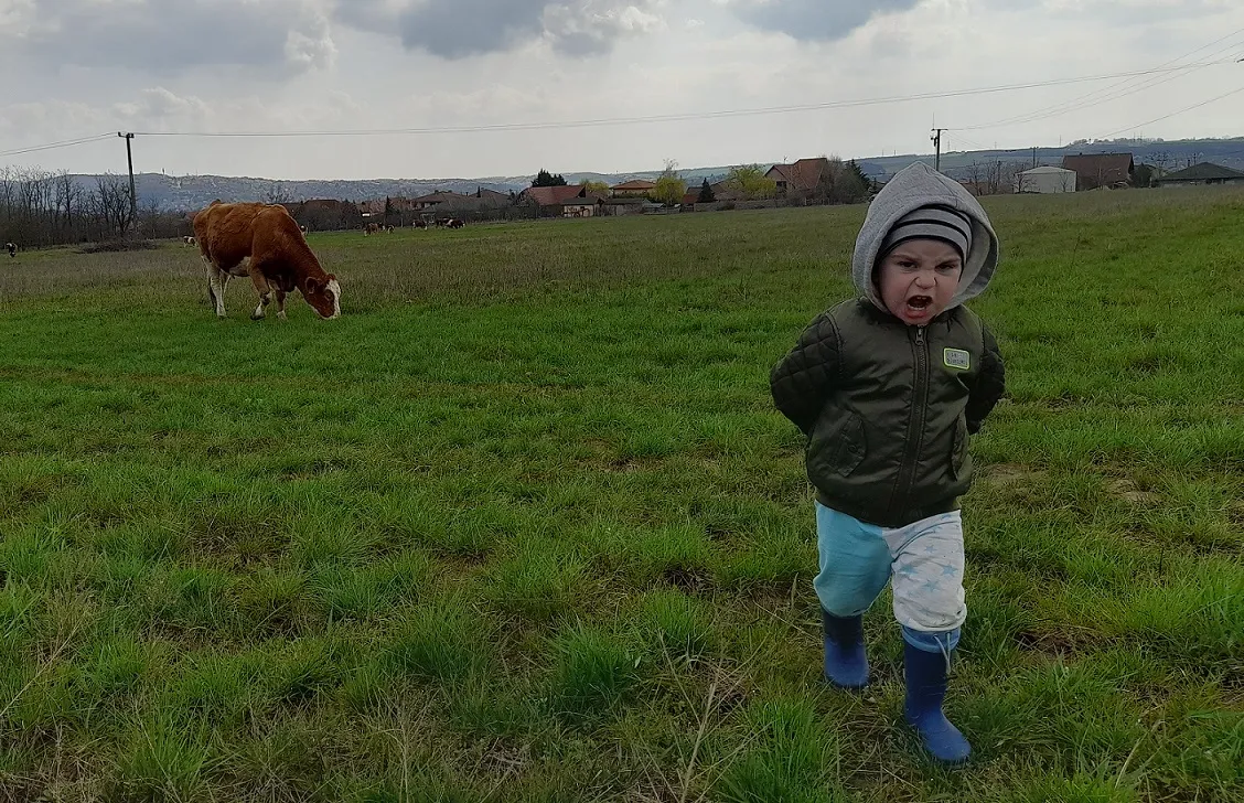
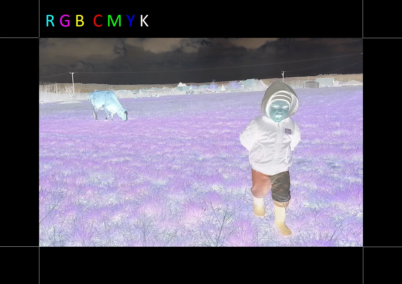
This is the photo I started with. My son was watching the neighbor’s cows with quite a bit of interest while I stood next to him. I wanted to snap a photo of him with the cow, so I stepped back a bit. His courage immediately evaporated, and he came running toward me, shouting not to leave him there. Dynamism and emotion—for me, this is bordering on accidental baroque. Let’s move on and convert this traditional RGB (Red, Green, Blue) image into CMYK (Cyan, Magenta, Yellow, Black).
We need to split the image into CMYK because that’s what printers use. They mix Cyan (C), Magenta (M), and Yellow (Y) to create every other color. These are the primary colors of subtractive color mixing. Black (K) is added for technical printing reasons: where something is black, all three colors would have to overlap perfectly, which uses a ton of ink. To save ink and improve sharpness, printers kept the black channel from the old B&W printing days.
Since I didn't quite understand how RGB turns into CMYK yet, I looked for an online converter.
I tried these two sites:
https://www.rgb2cmyk.org/
https://rgbtocmyk.net/
Both sites gave me back a slightly darker .tiff file with slightly different colors. I felt like the conversion was a fail. It’s possible that the Windows photo viewer (or whatever I used to check it—Paint, ImageJ, GIMP) simply detected the CMYK channels and automatically converted them back to RGB. It was weird that ImageJ only saw 3 RGB channels even after splitting. This is where I started digging deeper into how CMYK channels are actually generated.
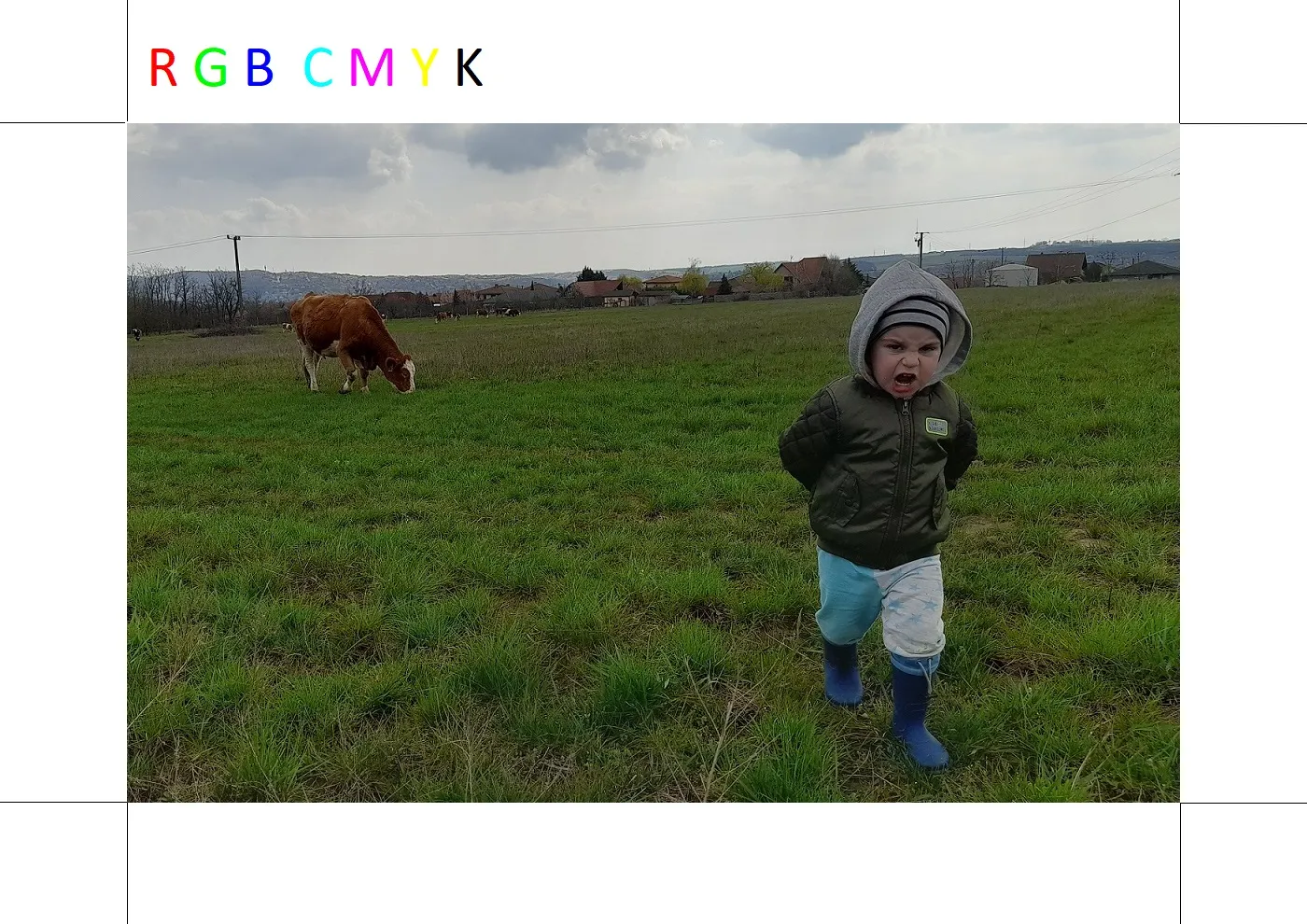
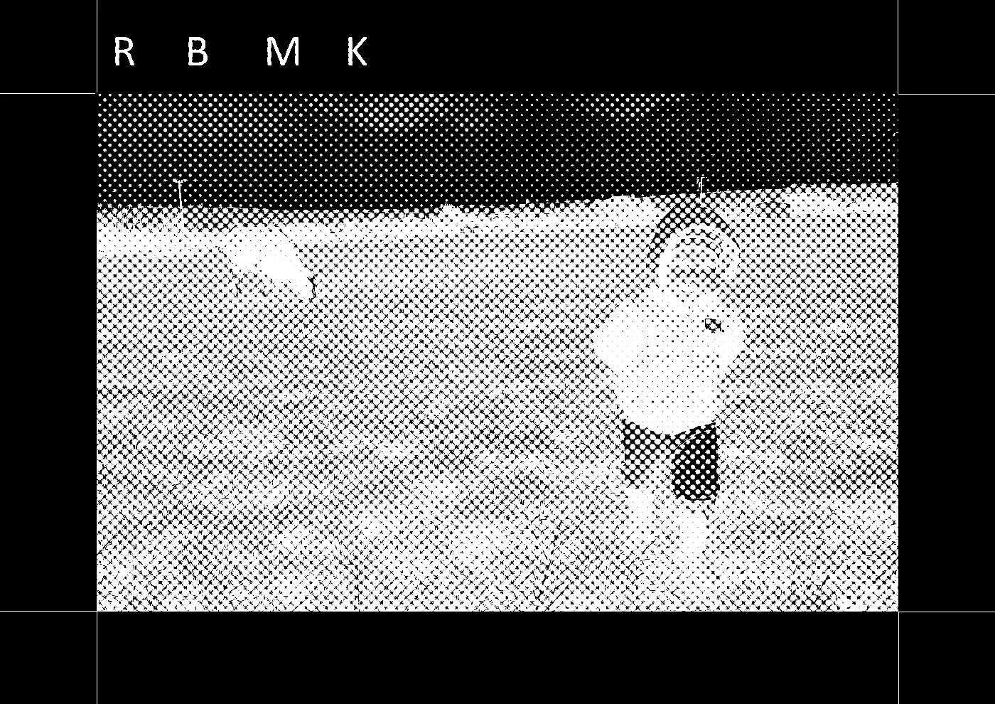
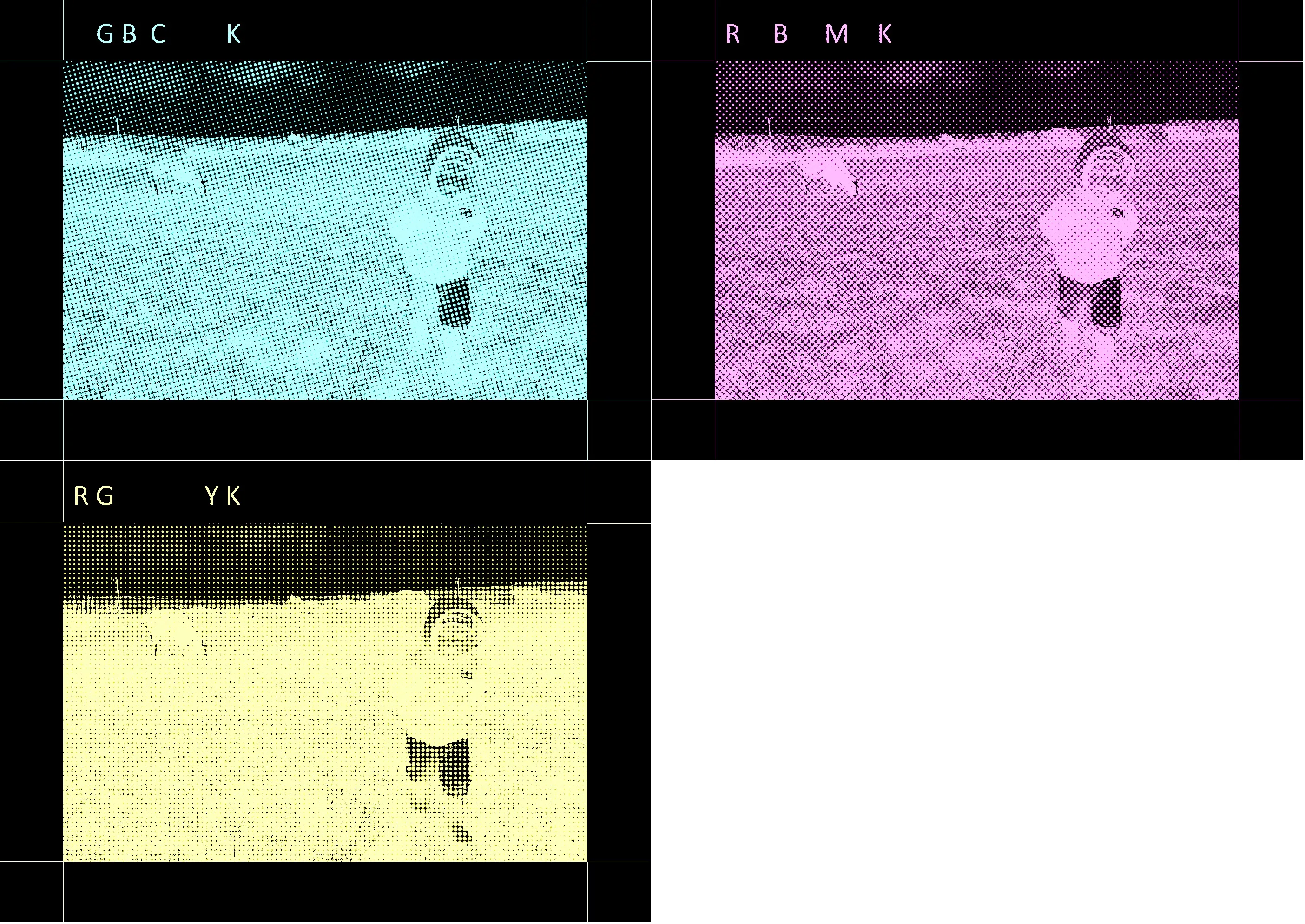
I knew I’d have to realign the four CMYK layers after printing, so I added black registration marks to the corners. I started splitting the channels in GIMP, but once the colorful image turned into B&W channels, it was hard to tell which was which. I added colored RGB and CMYK letters to the margin so I could track how each color changed.
Since I wasn't happy with the online RGB-to-CMYK converters, I decided to do it myself. An inverted RGB image is essentially a perfect CMY image. This is how RGB and CMY colors relate:
Green (G) + Blue (B) = Cyan (C)
Red (R) + Blue (B) = Magenta (M)
Red (R) + Green (G) = Yellow (Y)
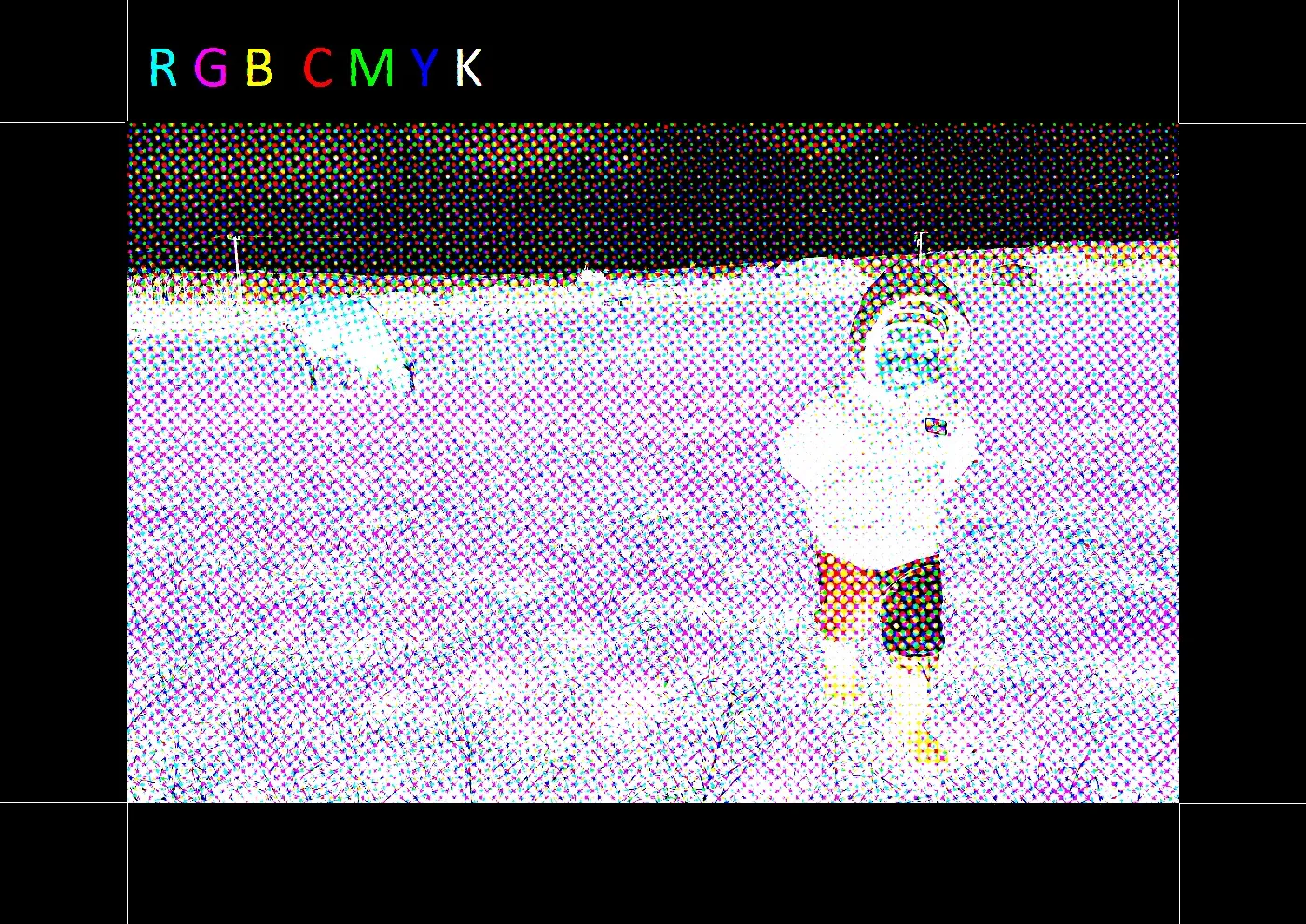
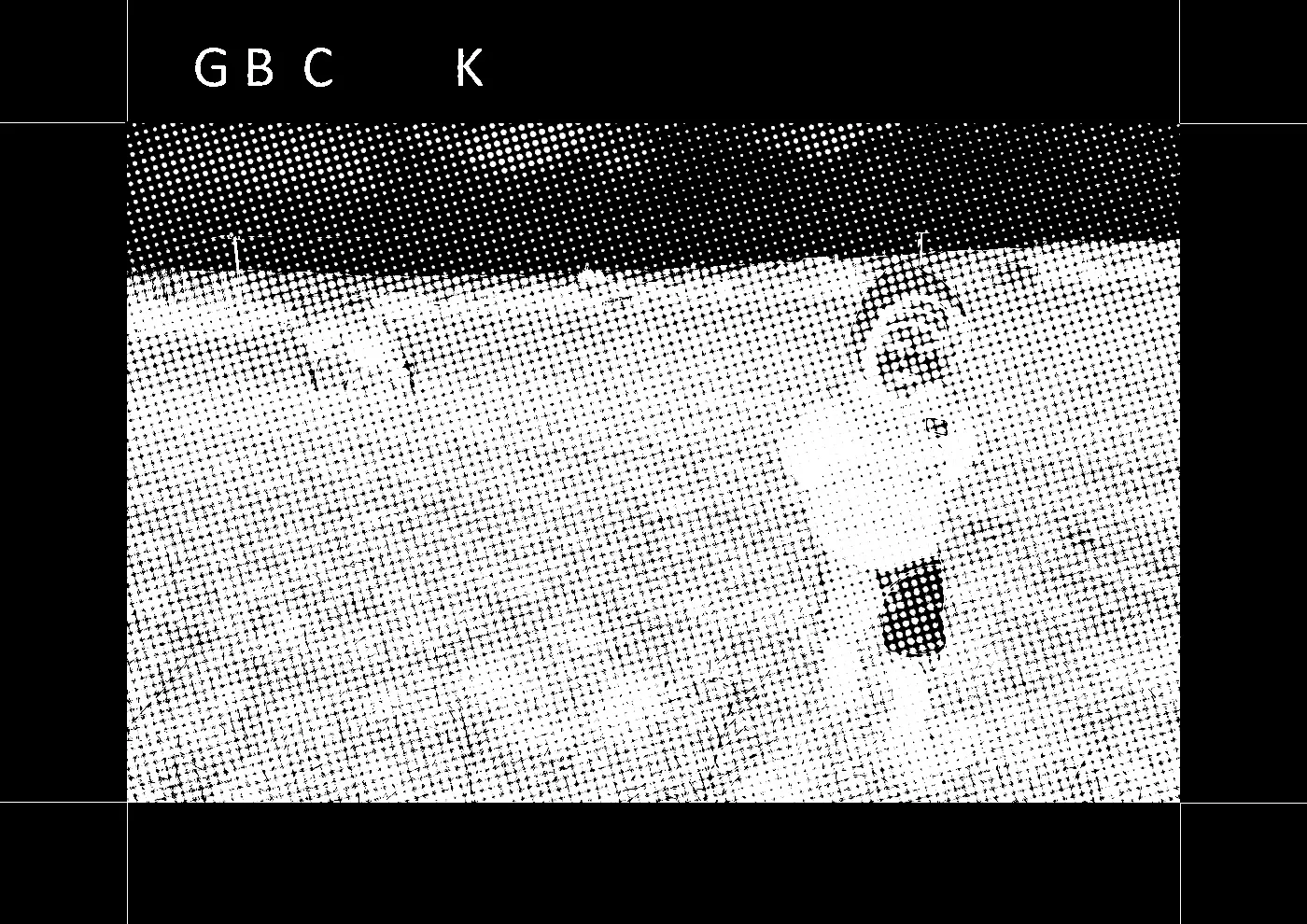
You can see at the top of the image that the RGB letters turned into Cyan, Magenta, and Yellow. I used the "Colors > Invert" command in GIMP.
Green (G) + Blue (B) = Cyan (C)
Red (R) + Blue (B) = Magenta (M)
Red (R) + Green (G) = Yellow (Y)
You can see at the top of the image that the RGB letters turned into Cyan, Magenta, and Yellow. I used the "Colors > Invert" command in GIMP.
The K channel is missing. I don't want to align four separate layers, so I’m only going to print a CMY image, but let me explain how that fourth (K) black channel is created.
For example, let's take a point with these values: C=120, M=60, Y=210. We look for the lowest value—in this case, Magenta at 60. This becomes our K value. Then, we subtract this K value from the original C, M, and Y values. The new values will be C=60, M=0, Y=150, plus K=60. For every pixel, one of the three CMY colors will drop to zero and be replaced by black. This is why color ink cartridges are smaller than black ones—you use less of them. In the printing industry, this is called GCR (Gray Component Replacement).
For example, let's take a point with these values: C=120, M=60, Y=210. We look for the lowest value—in this case, Magenta at 60. This becomes our K value. Then, we subtract this K value from the original C, M, and Y values. The new values will be C=60, M=0, Y=150, plus K=60. For every pixel, one of the three CMY colors will drop to zero and be replaced by black. This is why color ink cartridges are smaller than black ones—you use less of them. In the printing industry, this is called GCR (Gray Component Replacement).
The next step is creating a halftone image. This is necessary because a color printer only has four types of ink or toner and cannot print different shades. Think of an LCD screen: it uses RGB subpixels. If you look through a magnifying glass, you can see them dimming. At 8-bit resolution, you get 256 shades of blue. But Magenta ink on paper is binary: it’s either there or it isn’t. Since we can't "dim" the ink, we change the size or density of the dots to create lighter or darker shades.
In GIMP, I used the "Filters > Distorts > Newsprint..." menu.
In GIMP, I used the "Filters > Distorts > Newsprint..." menu.
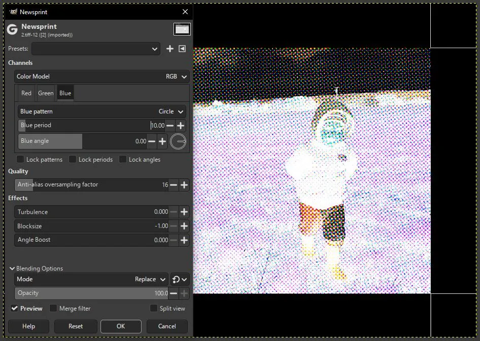
For the color model, I chose RGB (since that’s what I was working with, just inverted). I set the pattern to "circle" for all three channels, as that’s what newspapers usually use. The "period" is a key parameter—it sets the sampling rate for the halftone. If it’s too small, the dots bleed together; if it’s too large, resolution drops and you get a "pop art" effect. I went with a value of 10. Another vital setting is the screen angle for each channel. I kept the defaults for 3 channels, but for a proper 4-channel CMYK print, these angles are specifically adjusted to avoid issues.
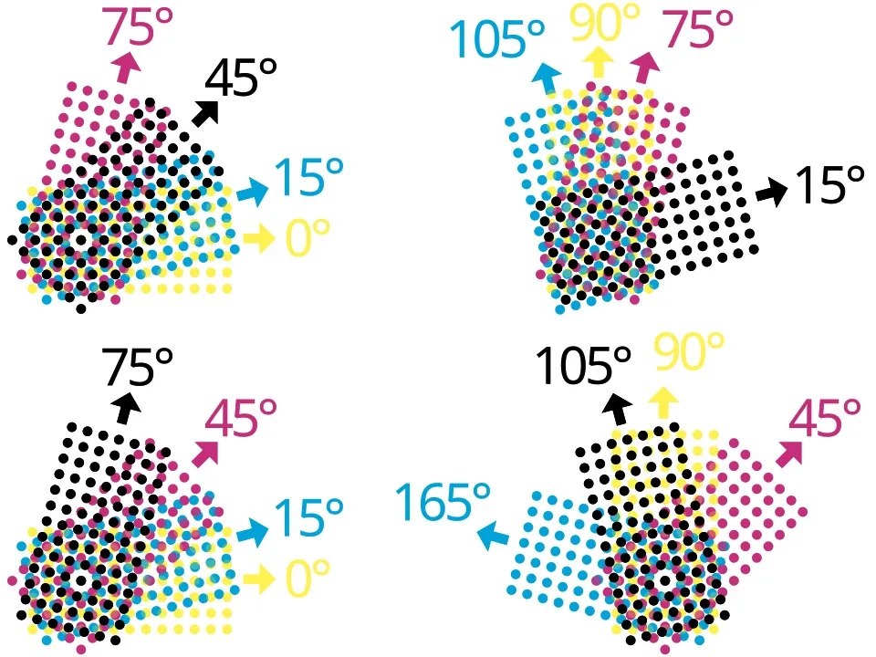
You can't just print the dots using the exact same grid for every color. If you print a Cyan dot directly on top of a Magenta dot, you just get Cyan (if the inks don't mix). Also, even a tiny misalignment between the grids would cause a "Moiré effect"—a huge mistake in printing. To prevent this, the dot grids for each color channel are rotated at specific angles. I think I’m the one learning the most from this project, not my son.
Once the halftone is ready, it’s best to split the image into channels by color. In GIMP, I used "Colors > Components > Extract Component." This gave me three monochrome channels. First is Cyan at a 15-degree angle.
Magenta at a 45-degree angle.
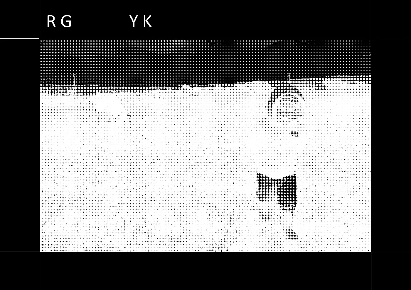
Yellow at a 0-degree angle.
Now I had to colorize these monochrome B&W images. Because of the inversion, the original R channel became C (or rather, the R channel carries the Cyan signal), Green became Magenta, and Blue became Yellow. I did this in GIMP using the "Colors > Colorize" menu.
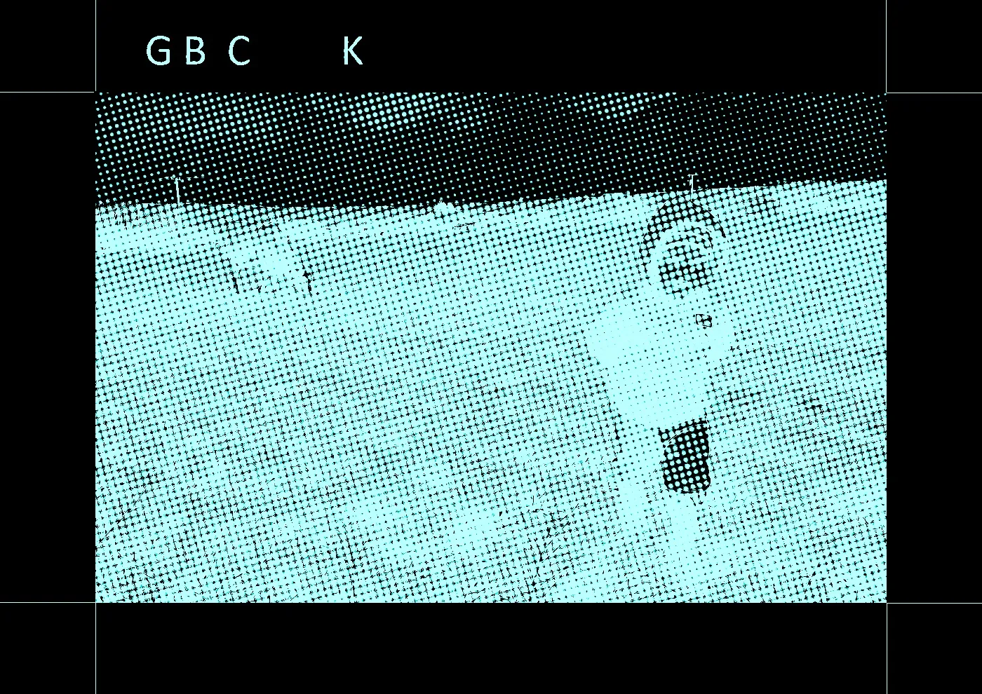
I lined the images up and was ready to print when I realized the printer would just use black ink for everything. It's fine that the image is monochrome, but I had to invert them again and play with the colors. It makes a huge difference whether an image is Cyan-on-Black or Cyan-on-White.
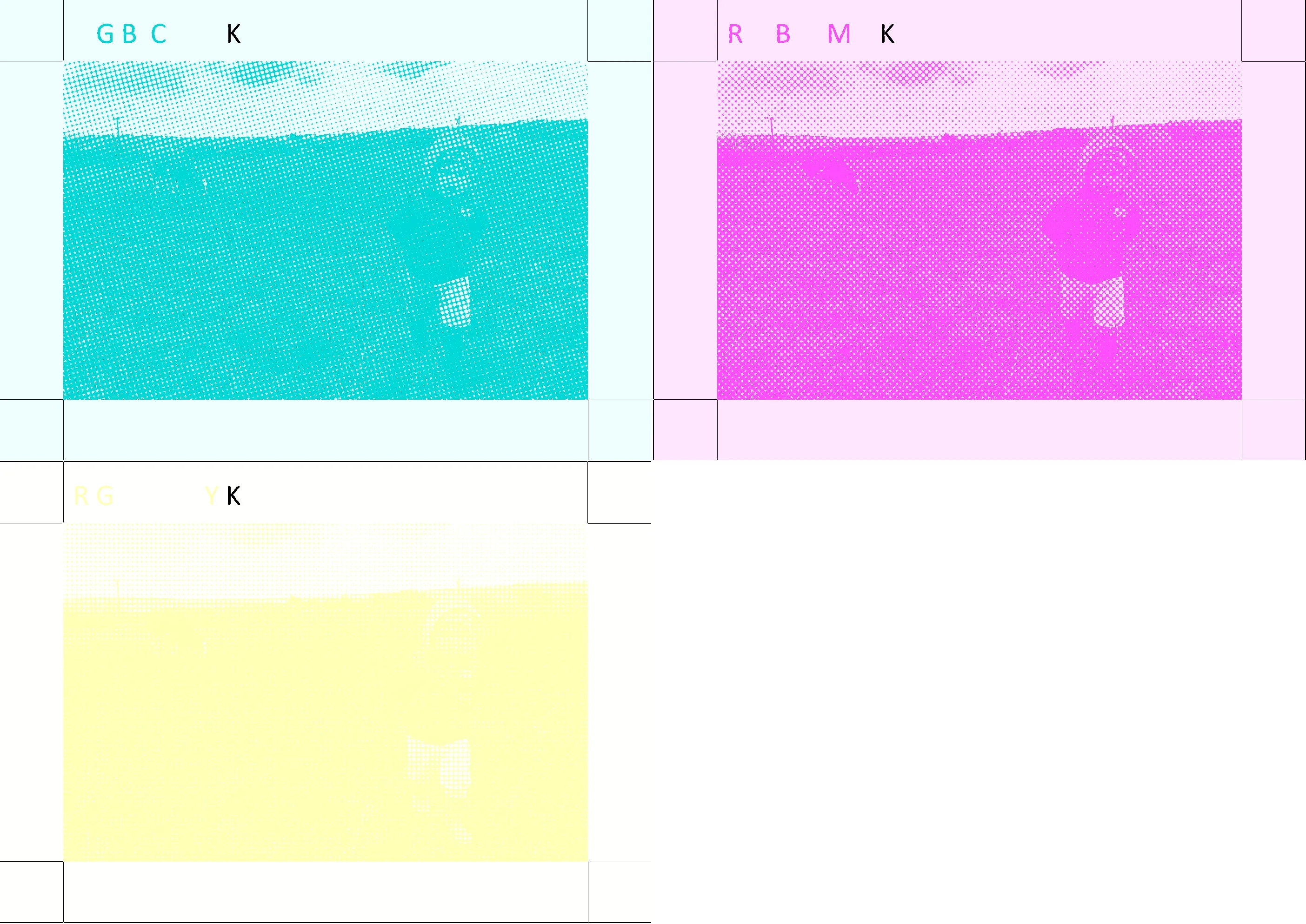
I managed to fix it in a few minutes. I colored the registration lines and the "K" markers black to help with positioning when I stack the layers.
A lot of people aren't familiar with overhead transparency film. It's a clear plastic sheet you can print on. Surprisingly, it’s still used for overhead projector presentations, but I’ve also used it to print an oscilloscope graticule for a battered old scope. It’s crucial to know there are two types: one for laser printers and one for inkjets. The inkjet version can't handle the heat of a laser printer. The laser version lacks the microscopic coating needed to absorb liquid ink. If you use a laser printer on inkjet film, the ink won't stick and will just wipe off. Worse, if you use inkjet film in a laser printer, it might melt onto the fuser roller, and you'll likely have to replace the whole unit. So, be careful.
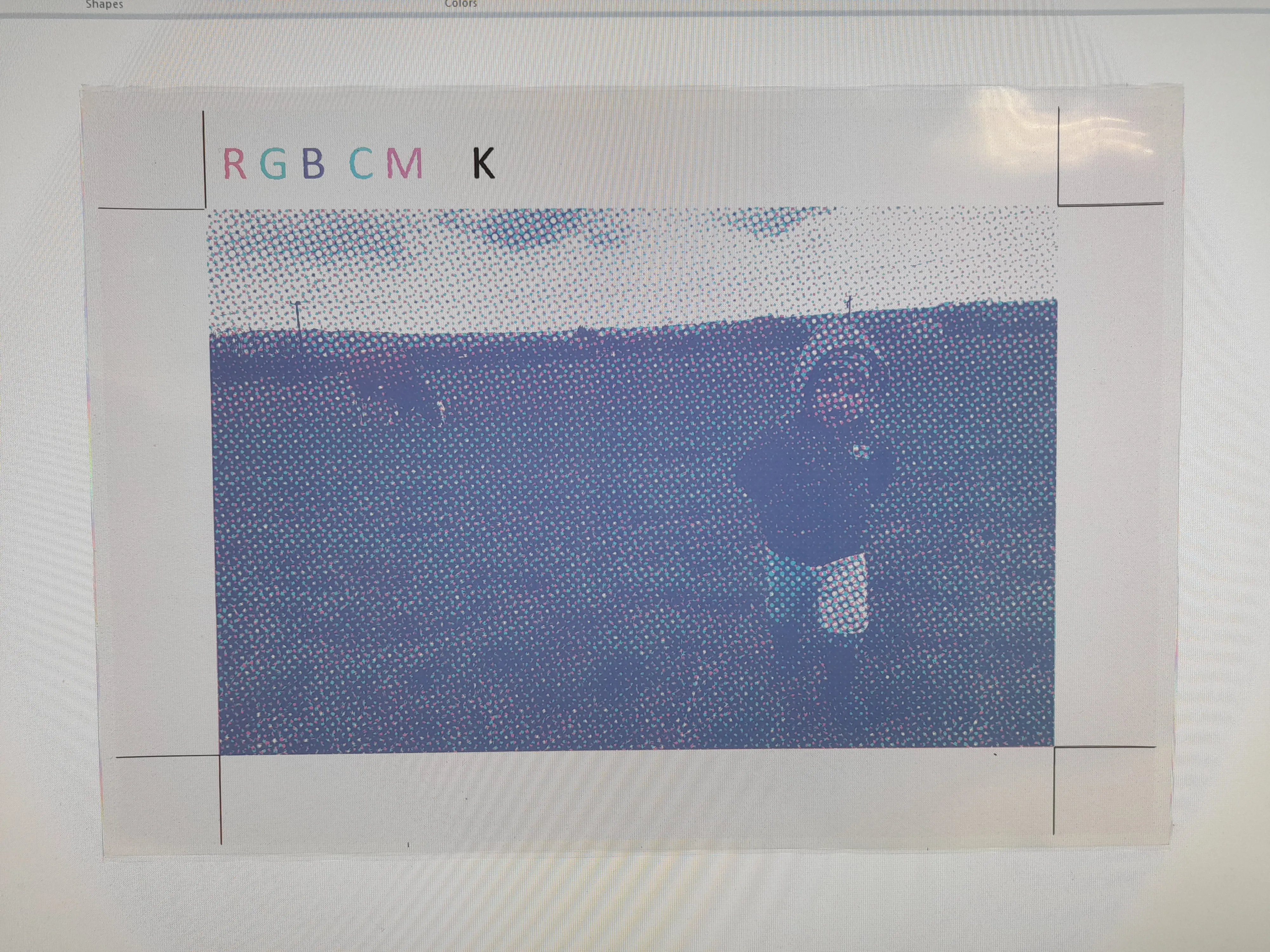
I printed the CMY images onto transparency film using a color laser printer. I stacked the films and placed them on my monitor for white backlighting. I’m really happy with the result. My "5-minute project" took a bit longer than expected, but I can proudly say that after two days of intense work and with the help of a color printer, I successfully managed to print... a color picture.
I spent so much time jumping between GIMP, Paint, ImageJ, and various online tools that I decided to give AI a shot. I asked it to build a tool that generates CMYK images. It took about 15 minutes and 5 iterations to throw together a working generator.
Available here.
Available here.
I learned a ton about color theory and printing. Now I look at magazine photos and those printer marks on the edges of packaging a bit differently. My son loved the transparency layers too. Now I’m thinking about trying to iron the images from the three films onto paper one by one—that would make it feel like a real DIY printing press.
Or I could print all three colors on one film and project it like a slide...
Time to call this project done.
Or I could print all three colors on one film and project it like a slide...
Time to call this project done.